Hi there!
Have you ever walked into a room and instantly felt energized, calm, or even inspired? That’s the power of color. Whether you’re sipping coffee in a sunny yellow kitchen or winding down in a soothing blue bedroom, the colors around you are shaping your emotions more than you might realize.
When it comes to remodeling your home, choosing the right colors is more than just picking what looks good—it’s about creating spaces that feel just right for you and your family. Imagine turning your living room into a cozy retreat, your office into a productivity hub, or your bathroom into a spa-like escape, all with the right palette.
In this blog, we’ll explore the fascinating psychology of color and how it can transform your home. From the warmth of reds and oranges to the serenity of blues and greens, I’ll guide you through the art of color selection to help you craft a space that resonates with your unique style and needs.
Color is pivotal in shaping our emotions and perceptions within our living spaces. When undertaking a whole home remodel, understanding the psychology of color can help you create environments that resonate with your desired mood and functionality. Thoughtful color choices can enhance your home’s atmosphere, influencing everything from relaxation to productivity.
Selecting the right palette for each room requires careful consideration of the space’s purpose and the feelings you want to evoke. Warm tones like reds and oranges can energize social areas, while cool blues and greens may promote tranquility in bedrooms. By creating a cohesive color scheme, you can ensure a harmonious flow throughout your home.
As you embark on your remodeling journey, remember that color is a powerful tool in interior design. It can make rooms feel larger, cozier, brighter, or more subdued. Your color choices will set the foundation for your home’s new look and feel, so take the time to explore how different hues might transform your space.
Prefer Listening? Here’s the Podcast Version:
Color psychology examines how hues affect human behavior and emotions1, influencing mood, functionality, and perception in home design. Broadly, colors can be categorized as:
Red: Enhances appetite, great for dining rooms.
Orange: Adds energy and cheerfulness, perfect for social spaces.
Yellow: Brightens kitchens or playrooms with cheerfulness.
Blue: Fosters calmness and productivity, ideal for home offices or bedrooms.
Green: Symbolizes balance and refreshment, versatile across various spaces.
Purple: Evokes creativity and luxury, ideal for accent walls or artistic spaces.
White: Creates spaciousness and cleanliness.
Gray: Provides versatility and spaciousness.
Black: Adds sophistication and drama.
Before you commit to a color, take a few swatches for a test drive. Try them out in different lighting—morning, evening, or even cloudy days—to make sure they create the vibe you’re aiming for.
Color plays a crucial role in shaping the mood2 and atmosphere of your home. It influences emotions, perceptions, and overall design aesthetic. Thoughtful color choices can transform your living spaces and reflect your style.
Color is a powerful tool in a home remodel, unifying spaces and creating visual flow. It can make rooms feel larger or more intimate, affecting one’s perception of space. When planning your remodel, consider how different hues will interact across rooms.
Start by selecting a base palette of neutral colors for walls and large surfaces. That provides flexibility and longevity to your design. You can introduce bold accents through furniture, artwork, or accessories to add personality and visual interest.
Remember that lighting significantly impacts color perception. Test paint samples in different lighting conditions before making final decisions.
Developing a cohesive color scheme is key to achieving your desired aesthetic. Begin by identifying colors that resonate with you and align with your home’s architecture and style.
Consider these popular approaches:
Variations of a single color create a harmonious and soothing look.
Colors opposite on the color wheel create bold, dynamic designs.
Colors adjacent on the wheel create a cohesive and balanced palette.
The colors you choose can completely transform the feel of a room, setting the mood and giving it personality. Want a cozy, relaxing vibe? Or maybe something bright and energizing? The right color scheme makes all the difference.
It’s all about balance. Love bold, vibrant colors? Pair them with softer, neutral tones to keep things inviting and not too overwhelming. Adding texture—like a soft rug, patterned pillows, or sleek finishes—brings depth and makes your space feel layered and interesting. Don’t be afraid to play with patterns and materials to create a look that feels uniquely yours!
Less is more! Minimalist design uses soft neutrals like whites, grays, and beige to create airy, uncluttered spaces. These tones pair beautifully with clean lines and natural light. Adding a single bold accent—like a navy feature wall or a striking piece of art—keeps it fresh and modern without overwhelming the senses.
When applying color psychology in your home, keep these factors in mind:
Choose colors that resonate with your personality and style. While psychology suggests red enhances appetite or blue promotes relaxation, your unique preferences should guide your palette.
Colors should align with the purpose of each room:
Natural and artificial light affect how colors appear. North-facing rooms may need warmer tones, while sunlit spaces can handle cooler hues. Always test colors at different times of the day.
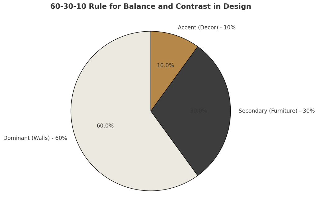
Use the 60-30-10 Rule to maintain harmony:
Colors hold different meanings across cultures:
Practical Tip: When choosing colors, balance cultural meanings with your preferences. For a universally appealing design, consider how visitors might perceive your space while still ensuring it reflects your individuality.
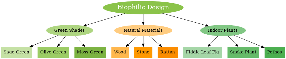
Green isn’t just a pretty color—it’s a mood booster! The biophilic design emphasizes natural elements and has made green shades like sage, olive, and moss staples for calming spaces. Picture a cozy bedroom with muted green walls, natural wood accents, and indoor plants—it’s like a breath of fresh air every time you walk in.
Color choices significantly impact the mood and functionality of each room in your home. Thoughtful selection can enhance the atmosphere, making spaces more inviting, relaxing, or energizing as needed.
In living rooms, aim for warm, welcoming tones. Consider earth tones like beige or soft browns to create a cozy atmosphere. Alternatively, use cool blues or greens for a calming effect.
For a vibrant living space, incorporate pops of bright colors as accents. Yellow throw pillows or orange artwork can add energy without overwhelming the room.
In open-concept areas, use a cohesive color palette to tie spaces together. Choose a neutral base color and add complementary hues to maintain visual flow.
Bedrooms benefit from soothing colors that promote relaxation. Soft blues, lavenders, or muted greens can create a tranquil environment conducive to sleep.
Avoid bright, stimulating colors in bedrooms. Instead, opt for cooler tones or warm neutrals like taupe or light gray.
Consider light, refreshing colors in bathrooms. Pale blues or greens can evoke a spa-like atmosphere. White tiles with colorful accents can make small bathrooms feel more spacious and clean.
Kitchens often benefit from energizing colors. Yellow can stimulate appetite and creativity, while warm reds or oranges can create a welcoming gathering space.
For home offices, choose colors that enhance focus and productivity. Soft greens promote concentration, while blues can boost mental clarity.
Choose cheerful colors in utility spaces like laundry rooms to make chores more pleasant. Light yellows or blues can brighten these often windowless areas.
When selecting colors, consider the natural light in each room. Rooms with ample sunlight can handle deeper tones, while darker spaces may benefit from lighter shades that reflect the available light.
These examples illustrate how strategic color choices can elevate both aesthetics and functionality.
Colors profoundly influence emotions and spark the imagination. Carefully chosen hues can transform spaces, altering your mood and enhancing creative thinking.
Your color selections dramatically shape a room’s atmosphere. Red can energize and excite, making it ideal for social areas like dining rooms. Blue promotes calmness and concentration, perfect for home offices or bedrooms.
Yellow brings cheerfulness and optimism to spaces. Green connects you with nature, fostering balance and harmony. Purple adds a touch of luxury and mystery.
Consider the intensity of colors, too. Bright shades stimulate, while muted tones soothe. Warm colors like orange create a cozy atmosphere, ideal for living rooms. Cool colors like light blue can make small spaces feel large.
Colors can energize or soothe the mind, transforming any room into a creative space. Imagine a workspace with vibrant orange walls—lively energy pushes you toward innovative ideas. Alternatively, picture a studio bathed in soft pastel blues, where calmness fosters imaginative brainstorming.
To achieve this effect, experiment with accent walls or colorful furniture to invigorate your space while keeping the design balanced. Strategic use of color can make your creative environment both functional and inspiring.
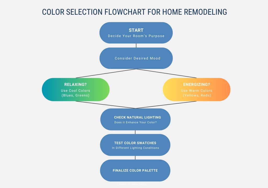
While the table provides a quick reference for understanding how colors influence mood, function, and room selection, the flowchart below takes it a step further by visually simplifying the process of selecting the right colors for your home remodeling project. Use them together to make informed, confident decisions about your design.
Natural elements and lighting play crucial roles in whole home remodeling. They influence color perception and can dramatically transform spaces.
Natural light reveals colors in their most accurate form. When planning your remodel, consider how sunlight enters each room throughout the day. Large windows and skylights can maximize natural light exposure, enhancing the vibrancy of your chosen palette.
Position furniture and decor to take advantage of natural light. Reflective surfaces like mirrors can help distribute light and make spaces feel larger and brighter.
Consider how artificial lighting affects color perception in the evenings. Warm lighting tends to make colors appear yellow or orange, while cool lighting can shift hues towards blue.
Consider how colors interact with natural elements when selecting colors for architectural features. Neutral tones can highlight unique architectural details without overpowering them.
Blues and greens can evoke a sense of nature and tranquility for accent walls or statement pieces. These colors work well in spaces with ample natural light.
Use color to emphasize or downplay architectural elements. Lighter colors can make ceilings appear higher, while darker shades can create a cozy atmosphere in larger rooms.
Incorporate natural materials like wood or stone to complement your color scheme and bring organic textures into your space. These elements can add visual interest and depth to your remodeled home.
As we dive into 2025, it’s fascinating to see how color choices continue to shape the ambiance of our homes. At Kaminskiy Design and Remodeling, we know firsthand how important it is for homeowners to stay informed about these trends while choosing designs that truly reflect their unique style and needs. Here’s what we’ve noticed homeowners in San Diego—and beyond—are prioritizing this year, based on the latest studies and what we’ve seen in our own projects:
Neutral Foundations with Bold Accents
We’ve seen a clear preference for neutral tones like white, beige, and soft grays, which form the base for 72% of kitchens and bathrooms. These timeless hues create a clean, versatile backdrop that works well with almost any style.
Layered Lighting for Enhanced Colors
Layered lighting has become an essential part of design, with 73% of designers emphasizing its importance for color perception.
Eco-Conscious Selections
The demand for eco-friendly design continues to grow, with homeowners increasingly opting for:
Natural Hues in Eco-Friendly Materials
Earthy tones and sustainable materials are redefining home design:
Living Spaces
Warm, inviting colors are taking over social areas like living rooms:
Bathrooms
Spa-like tranquility is the focus of bathroom design:
Sources: 2025 NKBA | KBIS Kitchen Trends Summit3, 2024 Lighting in Kitchen & Bath Design Report4, NKBA/KBIS 2024 Kitchen Trends Report5, NKBA Sustainability in Kitchen & Bath Design Report6
At Kaminskiy Design and Remodeling, we’re passionate about helping homeowners bring these trends to life in personal and timeless ways. Whether you’re drawn to bold accents, sustainable materials, or calming hues, our designers are here to guide you through every decision. Let’s work together to create a space that reflects your personality and enhances your lifestyle!
Contact us today to schedule a consultation—we can’t wait to help you design a home you’ll love for years to come.
Color is crucial in home remodeling, influencing mood, productivity, and even property value. Understanding color psychology can help you make informed choices for each room in your home.
Colors can significantly impact emotions and actions in your living spaces. Warm colors like red and orange can stimulate energy and appetite, making them suitable for dining areas. Cool colors such as blue and green tend to promote calmness and relaxation.
Yellow enhances creativity and positivity, making it a good choice for playrooms or home offices. Purple can add a touch of luxury and sophistication to formal living areas.
For relaxation, consider using cool, soothing colors in your living spaces. Soft blues and greens can create a tranquil atmosphere reminiscent of nature. These hues can help reduce stress and promote a sense of calm.
Pale lavender or light gray can also contribute to a serene environment. Avoid bright or intense colors in areas designated for rest and relaxation.
In a home office, select colors that enhance focus and productivity. Green boosts creativity and concentration, making it an excellent choice for work areas.
Blue can promote clear thinking and efficiency. Yellow, in moderation, can stimulate innovation and optimism. Avoid overly bright or distracting colors that might hinder concentration.
Color choices can significantly affect how you perceive a room’s size and dimensions. Light colors make spaces feel more extensive and open, while dark colors make rooms appear smaller and cozier.
Cool colors like blue and green can make walls appear to recede, creating an illusion of more space. Warm colors like red or orange can make walls feel closer, creating a more intimate atmosphere.
The colors you choose for your home can indeed impact its resale value. Neutral colors appeal to a broader range of potential buyers, potentially increasing your home’s marketability.
Bold or unusual color choices might limit buyer interest, potentially affecting the property’s value. Consider using neutral base colors with accent walls or decor to add personality without deterring potential buyers.
Select a base color that flows through multiple rooms to create a cohesive color scheme. Variations of this color in different intensities or shades create visual interest.
Consider using the color wheel to choose complementary or analogous colors for accents. This approach helps maintain harmony while adding depth to your overall design.
Choosing the right colors for your home remodel can feel overwhelming, but you don’t have to do it alone. At Kaminskiy Design and Remodeling, we specialize in turning your design dreams into reality. Our team of experts will guide you through every step, from selecting the perfect color palette to creating a cohesive and functional design that fits your lifestyle.
Contact us today for a consultation, and let us help you create a space that’s not only beautiful but also uniquely yours.
Schedule Your Design Consultation
Resources:

Kimberly Villa is a recognized expert in the Home Design and Remodeling industry. Her passion for the industry is matched only by her love for sharing insights, new trends, and design ideas. Kimberly’s expertise and enthusiasm shine through in her contributions to the Kaminskiy Design and Remodeling website blog, where she regularly shares valuable information with readers.