The galley kitchen is a polarizing design. To some people, it’s a sleek and hyper-efficient use of space. To others, it’s a compromise, a way to make the best of a tiny kitchen.
You either love or hate galley kitchens. Unfortunately, many folks who hate them are stuck living with one anyway. But there are ways to improve a galley kitchen. And if you love your galley already, these improvements will make it even better.
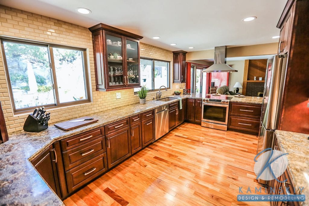
The Galley kitchen is a U-shaped design with two parallel counters, or “runs,” and a narrow floor running up the middle. Appliances usually face each other across this divide.
This setup is designed to squeeze every square inch of utility out of a small space.
This type of kitchen gets its name from the nautical term for a ship’s kitchen. Ship’s galleys are highly functional and organized because they have to be. They’re tight but provide enough room to get the job done.
Galley kitchens aren’t as cramped as galleys, but the idea is the same: no matter how little space there is to work with, the right design can squeeze everything in.
The galley layout began with the revolutionary Frankfurt Kitchen in 1926, designed by Margarete Schütte-Lihotzky, Austria’s first female architect. Her kitchen was a game-changer for home design, the first kitchen built around how we cook.
In the second half of the 20th century, galley kitchens fell out of fashion as the popularity of open kitchens took off, and Americans began building suburbs.

In their history of the galley kitchen, CityLab points out that the American dream kitchen has tended to have a “pro-suburban bias.” There’s some truth to that. A big open kitchen with an island is right up there with the white picket fence and the two-car garage as a dream home cliché.
However, younger generations have a different dream; they prefer cities. Many millennials will make do with a much smaller living space if it means they can live closer to the culture and activity of an urban hub. San Diego is a little more spread out than most cities, but space is at a premium here, too.
Galley kitchens are now in high demand. The U-shaped kitchen was the most popular layout, according to a 2017 survey by Houzz. A remodeling company in Maryland and Virginia found that 85% of their customers prefer the sleek simplicity of a galley kitchen.
There has even been a cultural backlash against open kitchens from defenders of the galley kitchen. The New Yorker featured “The Case Against Open Kitchens.” Salon took things a step further in “Close your Open-Concept Kitchen,” in which Bryan Lowder writes, “We have doors and walls for a reason.”
All history and cultural issues aside, here are a few practical upsides to the galley kitchen.
The galley is designed with the cook in mind. The floorplan shrinks the “kitchen triangle” workspace down to just a few steps.
The parallel surfaces promote Intuitive workflows, like having the fridge next to the sink and prep area.
Cooking is messy. A galley kitchen contains the mess and can keep it out of sight.
Unless your home or apartment is big enough to have a dining room away from your kitchen, it’s hard to have a truly separate dining area when you have an open floor plan.
Sometimes, it’s nice to be “alone in the kitchen,” to quote Julia Child. Some people prefer to cook that way. A galley design makes the kitchen a space apart from the rest of your home, a space devoted to cooking and nothing else.
A galley kitchen can be a nook of privacy and calm in an otherwise open-planned house or apartment.
Remodeling or designing a galley kitchen from scratch means using significantly less square footage of countertops and cabinets. You can spend the money you save on appliances, and since those appliances will likely be the smaller models, you might be able to go higher-end than if you were buying big ones.
No space is wasted in a galley kitchen. You’re surrounded by storage on both sides, and everything serves a purpose.
For tiny kitchen inspiration, check out chef Michael Lomonaco’s 7’x10′ kitchen in his Manhattan apartment.
When you have to make everything work in a cozy kitchen, you end up reevaluating what you actually need.
When cookbook author Jenny Rosenstrach renovated her kitchen, she found herself simplifying her setup. She told the Washington Post,
“I gave away three cabinets’ worth of small appliances, bowls, and mugs, and I have not once said to myself, ‘Oh, I wish I had that back.'”
Again, this is a design you either love or hate. The haters will point out a few “cons,” starting with the most obvious one…
Architectural Digest’s article on galley kitchens discusses “meager square footage” and uses the word “claustrophobic.” They go on to say some nice things, too, but the space issue can’t be ignored.
The whole point of this design is that there’s just enough room to turn around. It’s OK if you’re alone, but the phrase “too many cooks” comes to mind when others are in the kitchen trying to help with dinner. And when you’re dealing with hot things and sharp things, bumping into someone can be dangerous. For this reason, it’s not the most kid-friendly layout.
From a design point of view, you need to think about where you want your kitchen and fridge doors to swing so they don’t get in the way.
The average buyer has preferred an open kitchen for over a half-century, and that probably isn’t going to change anytime soon.
As Architectural Digest put it,
“Few people will step into a potential apartment or house and think, Oh yay! A galley kitchen!”
You don’t need an open kitchen with a working island to cook for a 10-person dinner party, but that setup does make it easier to entertain while you cook. In a traditional galley kitchen, on the other hand, you’re kind of isolated.
It’s possible for even the biggest galley-hater to transform this design into something they can at least live with.
With a few adjustments, you can have both layouts in one.
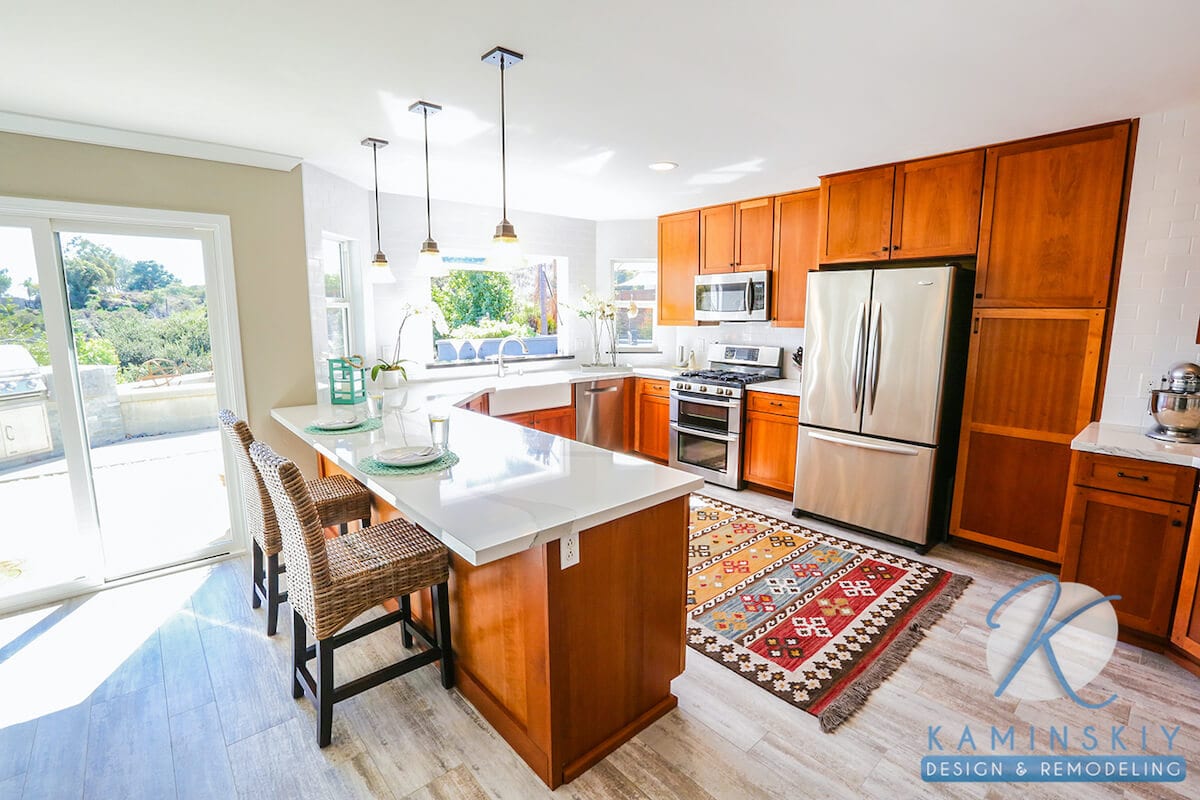
Putting a window or open space over the sink is one option that dates back to the earliest galley kitchens.
One side of the kitchen can be a bar facing out. If you’re not a galley purist, you can use an island between your kitchen and the next room. Put barstools on the open side—like a Japanese izakaya—for the social benefits of an open kitchen and the efficiency of a galley kitchen.
Light is your friend in a kitchen that can feel like a tunnel.
The scenic option is to put a window at one end. You could also try the old mirror trick. A mirror not only adds light but makes the space look bigger. Another way to reflect light is with glossy cabinets.
The color white can add brightness. Bold colors can break up the straight lines that dominate this type of kitchen.
Save space with a built-in microwave. Make space-saving classy with a built-in wine cubby.
The lines of the parallel countertops direct our eyes to whatever’s on the back wall, so make it interesting.
Try a colorful backsplash, hang some art, or put the stove or the fridge there.
This involves some major work, but high ceilings can make things feel brighter and less cramped. Consider shelves instead of hung cabinets.
Another name for a galley kitchen is a “corridor kitchen.” One way to open things up is to make it an actual corridor, open at both ends.
Love or hate them, galley kitchens are a reality in many first and smaller homes. But you don’t have to feel stuck with one. Some simple improvements can make a big difference in these little kitchens.
A galley kitchen is a U-shaped design with two parallel counters or “runs” and a narrow floor running up the middle, with appliances usually facing each other across this divide.
It gets its name from the nautical term for a ship’s kitchen. Ship’s galleys are highly functional and organized because of limited space, mirroring the efficiency and compactness of galley kitchens.
The Frankfurt Kitchen, designed by Margarete Schütte-Lihotzky, Austria’s first female architect, was revolutionary as it was the first kitchen built around how we cook, marking the beginning of the galley layout.
Galley kitchens are designed with the cook in mind, offering an efficient workspace. They contain cooking messes, provide privacy for cooking, save on remodeling costs due to less square footage required, make optimal use of small spaces, and encourage decluttering.
Some improvements include adding a window or open space over the sink, making one side of the kitchen a bar facing out, using bright colors or mirrors to reflect light, building in as much as possible, adding design elements to the end wall, raising the ceilings, or opening both ends to make it feel like a corridor.

Kimberly Villa is a recognized expert in the Home Design and Remodeling industry. Her passion for the industry is matched only by her love for sharing insights, new trends, and design ideas. Kimberly’s expertise and enthusiasm shine through in her contributions to the Kaminskiy Design and Remodeling website blog, where she regularly shares valuable information with readers.